

Add a Feature
UX & UI Design
Figma
4 weeks
Pinterest is a visual discovery engine and social media platform where users can share and discover images, videos, and ideas, organized into boards and "pins" for inspiration, planning, and shopping.
This project was completed for a UI/UX design course by Designlab. The prompt was “Adding a feature” to an existing website or app.
The Research
My goal was to find which areas the Explore page could be improved on and what feature can be added to increase utilization of the page.
Methods used:
Competitor Analysis | Surveys | User Interview
Competitor Analysis
I analyzed several websites that also have an Explore page and identified the layout and main features that create the experience for users.
Survey
The participants of the survey were current Pinterest users. With this data, I was able to gather detailed opinions about the current design and how to build a better design.
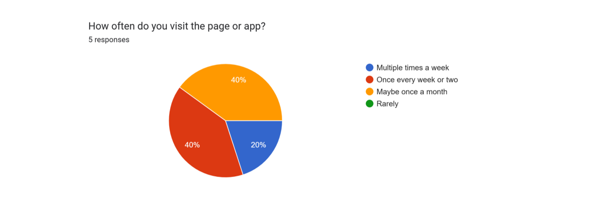
Survey participants were all regular users
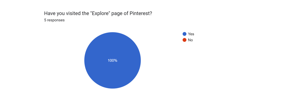
The percentage of people that use Pinterest have utilized the Explore page, showing demand

The opinions on the current design of the Explore page were very mixed
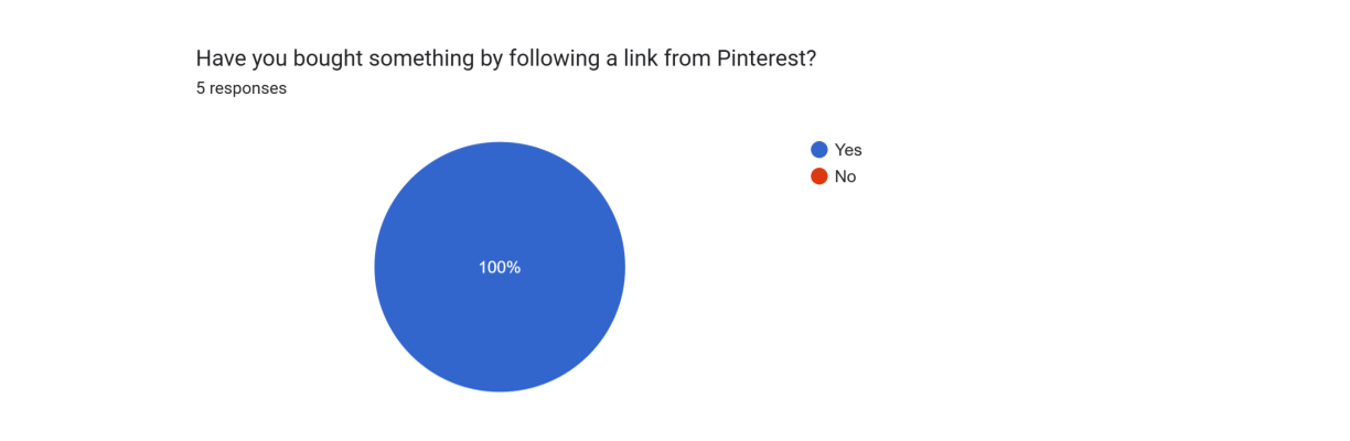
If all users have purchased through Pinterest, it shows that optimizing the shopping experience is a priority
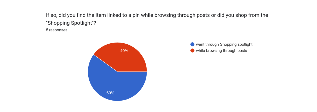
Survey found that more shopping traffic has gone through the Explore page than just normal browsing
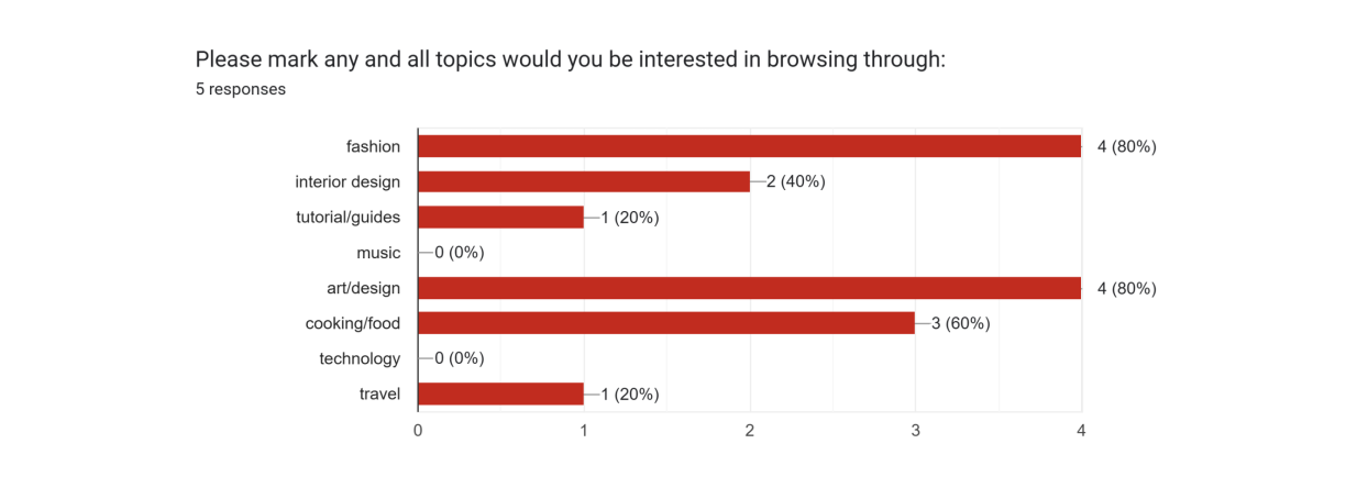
This poll was put out to gauge which categories could be a good addition as a section in the Explore page
User Interview
I conducted four interviews with Pinterest users. These participants varied in age and proficiency in technology, ensuring insights into remaking the Explore page user friendly for everyone.
75% of participants reported some type of dissatisfaction with the current functionality of Pinterest
50% of participants reported that they were interested in more personalized content
The Design
Features & Wireframing
Popular on Pinterest
An element that was relocated from the search bar to the page so users have another way to find content they align with
Shopping Spotlight
The blocks were redesigned to a variety of sizes to match the home page feed
Stay Inspired
A 4x4 design was implemented to give the users a better look of what is in each shopping category
Final Results

Conclusion
Redesigning an already existing product came with different challenges than an end-to-end project. It was eye opening to see how much work can go into one single feature. However, it was fulfilling to develop and work on something into a better design for users to enjoy.
A survey was done with the same participants and 100% of participants enjoyed the new design more than the original!